Statistical analysis
Imports
from pathlib import Path

import matplotlib.pyplot as plt
import matplotlib.ticker as mticker
import numpy as np
import polars as pl
import seaborn as sns
from scipy.stats import pearsonr

sns.set_theme(context="paper", style="ticks", palette="deep", color_codes=True)
plt.rcParams["figure.autolayout"] = True
plt.rcParams["figure.dpi"] = 300
Loading data
head_coach = (
    pl.read_csv(Path("./data/head_coach.csv"))
    .cast({"Appointed": pl.Date, "EndDate": pl.Date})
    .filter(pl.col("Tenure") <= 3000)
)
General plotting function
import statsmodels.api as sm
from sklearn.preprocessing import PolynomialFeatures
def prepare_data(data, x_value, y_value, degree=2):
# Convert polars dataframe columns to numpy arrays
x = data.get_column(x_value).to_numpy().reshape(-1, 1)
y = data.get_column(y_value).to_numpy().flatten()
polynomial_features = PolynomialFeatures(degree=degree)
xp = polynomial_features.fit_transform(x)
return xp, y, polynomial_features
def fit_model(xp, y):
model = sm.OLS(y, xp)
results = model.fit()
return results
def create_predictions(results, polynomial_features, x_min, x_max):
xs = np.linspace(x_min, x_max).reshape(-1, 1)
xs = polynomial_features.transform(xs)
ys = results.predict(xs)
predictions = results.get_prediction(xs)
ci = predictions.conf_int()
return xs, ys, ci
def create_polynomial_regression_plot(
data, x_value, y_value, y_leg, color, title, xlabel, degree=2, integer_ticks=False
):
xp, y, polynomial_features = prepare_data(data, x_value, y_value, degree)
results = fit_model(xp, y)
xs, ys, ci = create_predictions(
results,
polynomial_features,
data.get_column(x_value).min(),
data.get_column(x_value).max(),
)
plt.figure()
x_vals = data.get_column(x_value).to_numpy().flatten()
y_vals = data.get_column(y_value).to_numpy().flatten()
plt.scatter(x_vals, y_vals, color=color, alpha=0.2)
(line,) = plt.plot(xs[:, 1], ys, color=color)
plt.fill_between(xs[:, 1], ci[:, 0], ci[:, 1], color=color, alpha=0.3)
plt.title(title)
plt.xlabel(xlabel)
plt.ylabel(f"{y_leg.capitalize()} percentage")
plt.gca().yaxis.set_major_formatter(mticker.PercentFormatter(xmax=100))
if integer_ticks:
plt.xticks(np.arange(min(x_vals), max(x_vals) + 1, 1.0))
r, p = pearsonr(x_vals, y_vals)
plt.legend(
[line, line],
[
f"Polynomial regression (degree {degree})",
f"Pearson correlation : $r = {r:.2f}$, $p = {p:.2f}$",
],
loc="upper right",
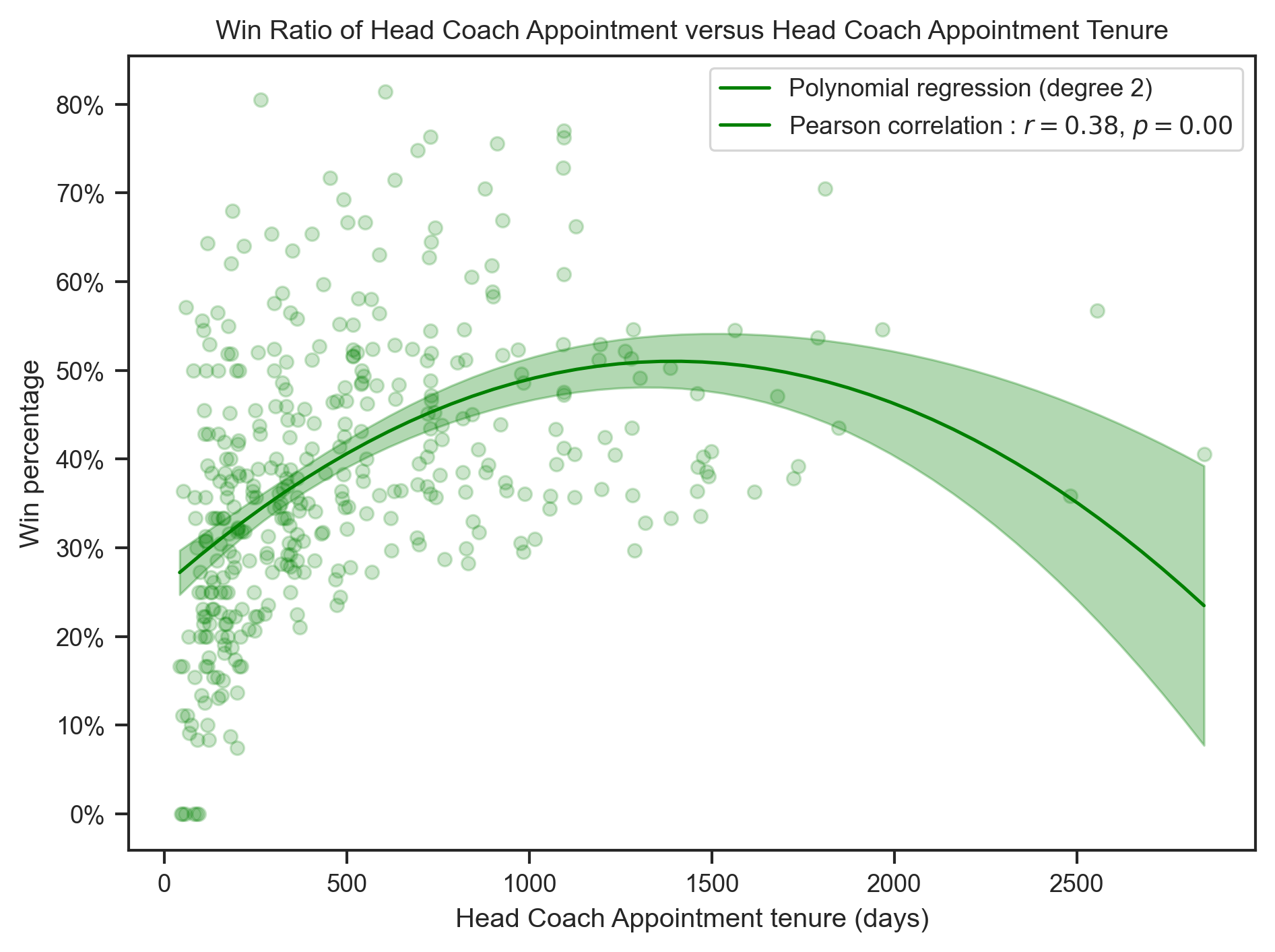
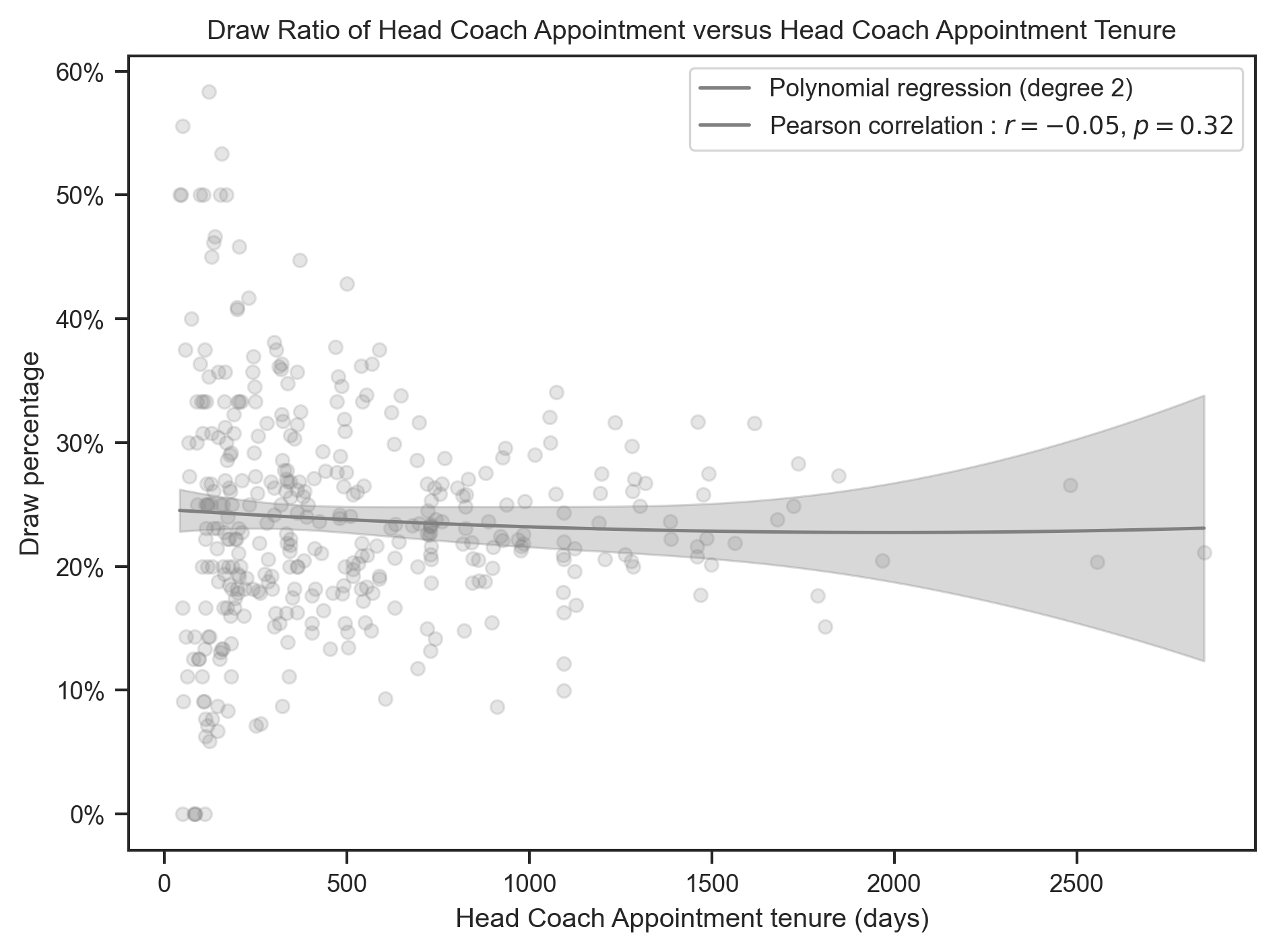
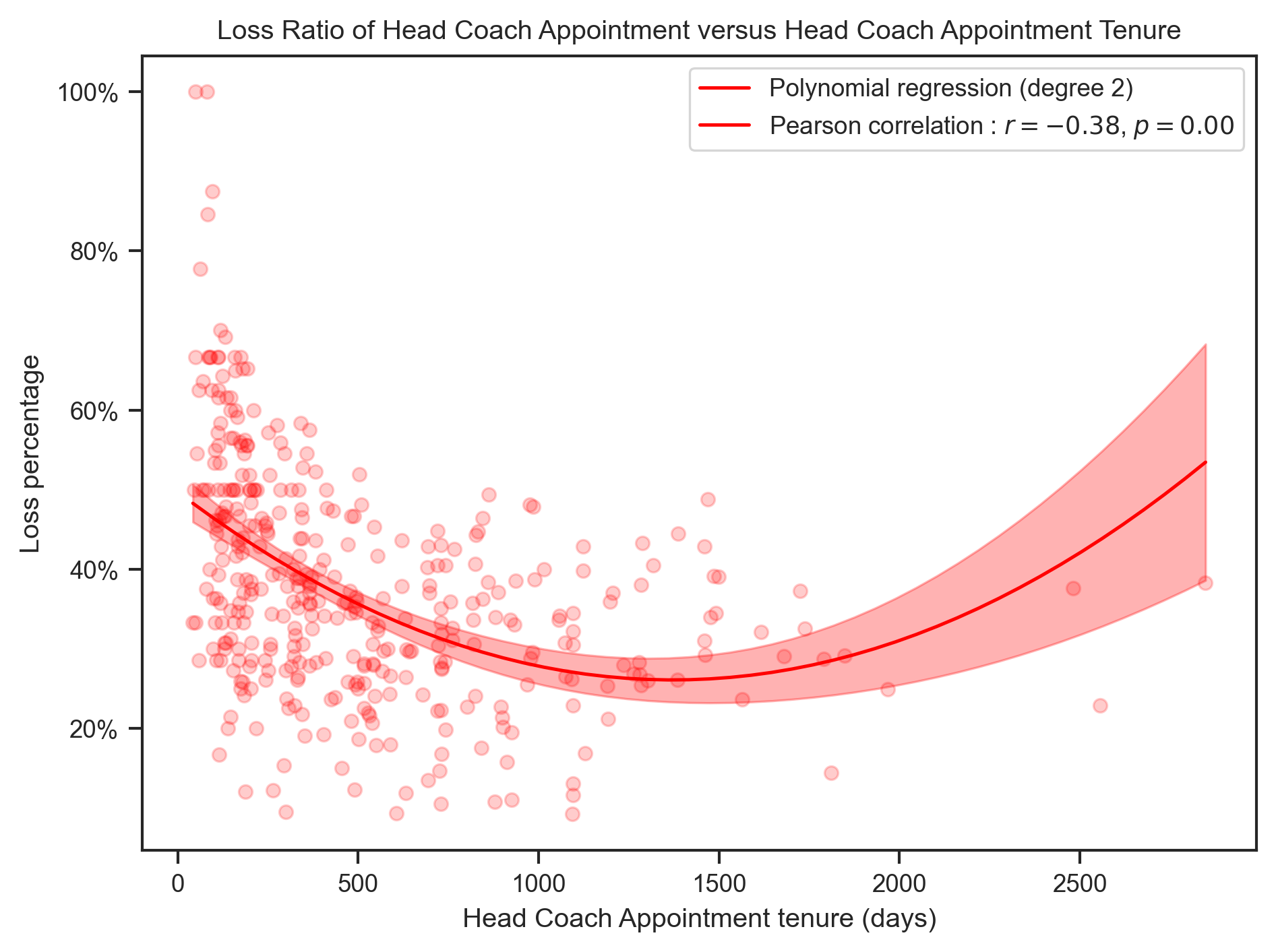
)Relation between Head Coaches appointments results and Head Coaches Tenure in Club
head_coach = head_coach.with_columns(
    (pl.col("Wins") / pl.col("Matches") * 100).alias("WinPercentage"),
    (pl.col("Draws") / pl.col("Matches") * 100).alias("DrawPercentage"),
    (pl.col("Losses") / pl.col("Matches") * 100).alias("LossPercentage"),
)

title = "{} Ratio of Head Coach Appointment versus Head Coach Appointment Tenure"
x_label = "Head Coach Appointment tenure (days)"
create_polynomial_regression_plot(
head_coach,
"Tenure",
"WinPercentage",
"Win",
"green",
title.format("Win"),
x_label,
degree=2,
)
create_polynomial_regression_plot(
    head_coach,
    "Tenure",
    "DrawPercentage",
    "Draw",
    "gray",
    title.format("Draw"),
    x_label,
    degree=2,
)
create_polynomial_regression_plot(
    head_coach,
    "Tenure",
    "LossPercentage",
    "Loss",
    "red",
    title.format("Loss"),
    x_label,
    degree=2,
)
Relation between Clubs Results and Number of Head Coaches
club_results = (
head_coach.group_by("Team")
.agg(
pl.col("Wins").sum(),
pl.col("Draws").sum(),
pl.col("Losses").sum(),
pl.col("Matches").sum(),
pl.col("HeadCoach").count().alias("CoachCount"),
)
.with_columns(
(pl.col("Wins") / pl.col("Matches") * 100).alias("WinPercentage"),
(pl.col("Draws") / pl.col("Matches") * 100).alias("DrawPercentage"),
(pl.col("Losses") / pl.col("Matches") * 100).alias("LossPercentage"),
)
)
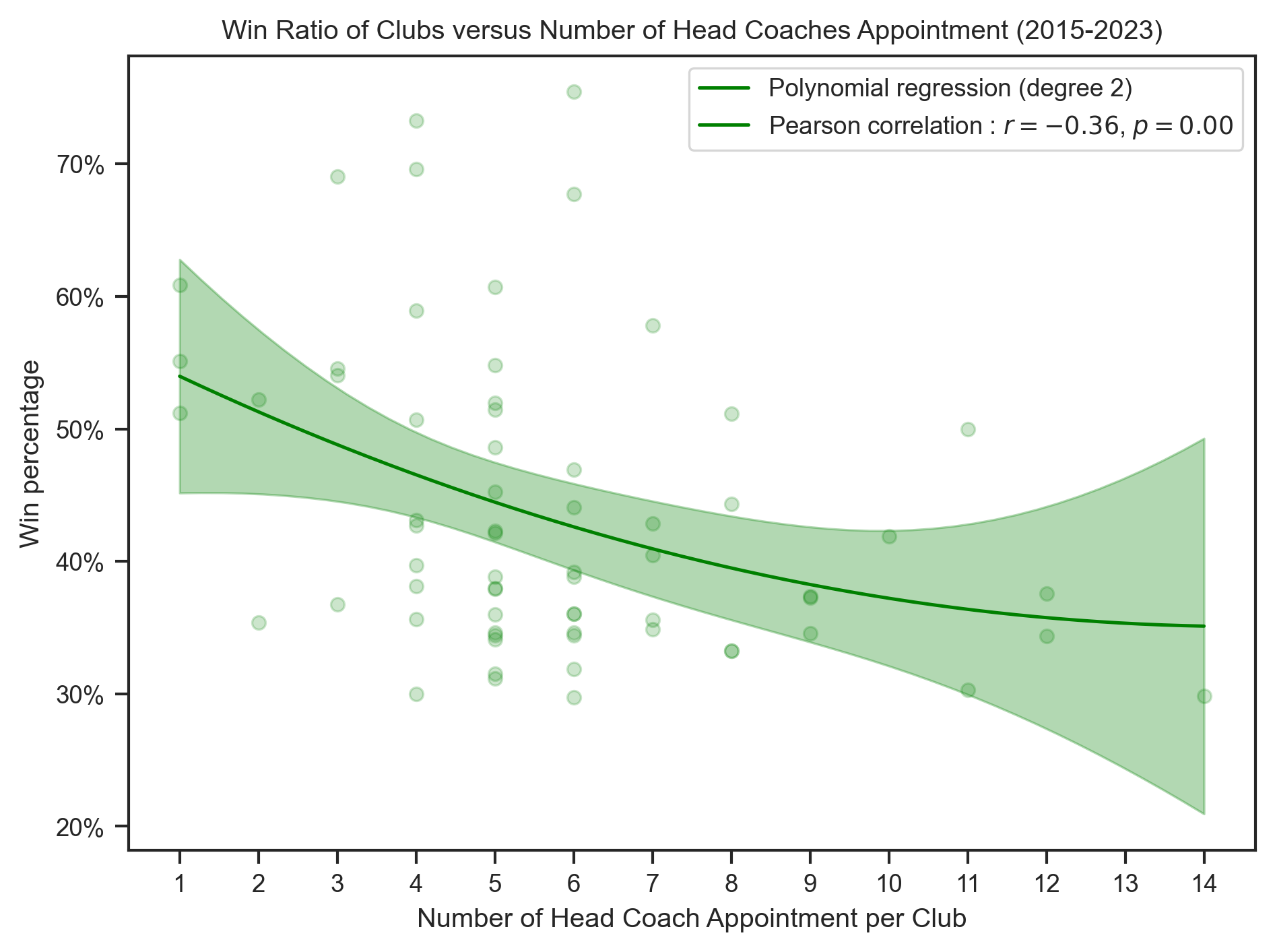
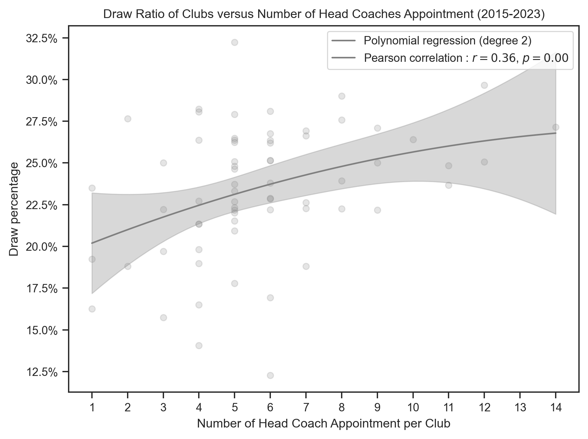
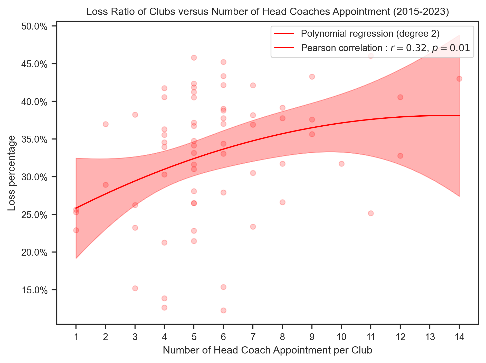
title = "{} Ratio of Clubs versus Number of Head Coaches Appointment (2015-2023)"
x_label = "Number of Head Coach Appointment per Club"create_polynomial_regression_plot(
club_results,
"CoachCount",
"WinPercentage",
"Win",
"green",
title.format("Win"),
x_label,
degree=2,
integer_ticks=True,
)
create_polynomial_regression_plot(
    club_results,
    "CoachCount",
    "DrawPercentage",
    "Draw",
    "gray",
    title.format("Draw"),
    x_label,
    degree=2,
    integer_ticks=True,
)
create_polynomial_regression_plot(
    club_results,
    "CoachCount",
    "LossPercentage",
    "Loss",
    "red",
    title.format("Loss"),
    x_label,
    degree=2,
    integer_ticks=True,
)
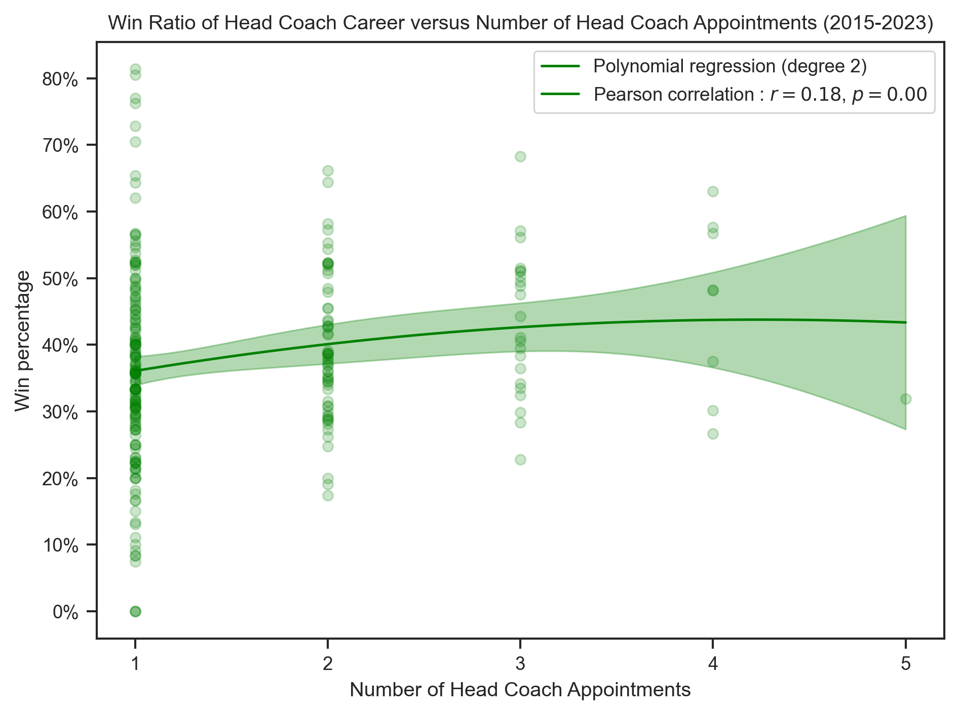
Relation between Head Coach Aggregated Performance versus Total Number of Clubs Head Coaches Worked for
# Plot of wins, draw and losses percentage over number of club head coach has been
hc_results = (
head_coach.group_by("HeadCoach")
.agg(
pl.col("Matches").sum(),
pl.col("Wins").sum(),
pl.col("Draws").sum(),
pl.col("Losses").sum(),
pl.col("Team").count().alias("ClubCount"),
)
.with_columns(
(pl.col("Wins") / pl.col("Matches") * 100).alias("WinPercentage"),
(pl.col("Draws") / pl.col("Matches") * 100).alias("DrawPercentage"),
(pl.col("Losses") / pl.col("Matches") * 100).alias("LossPercentage"),
)
)
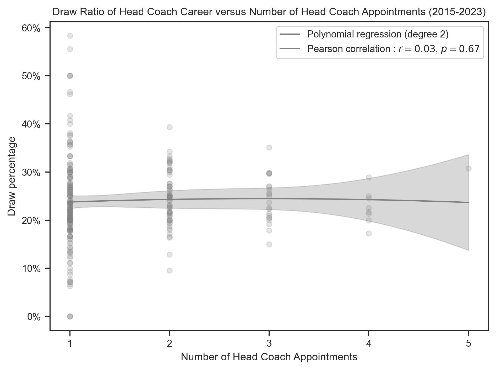
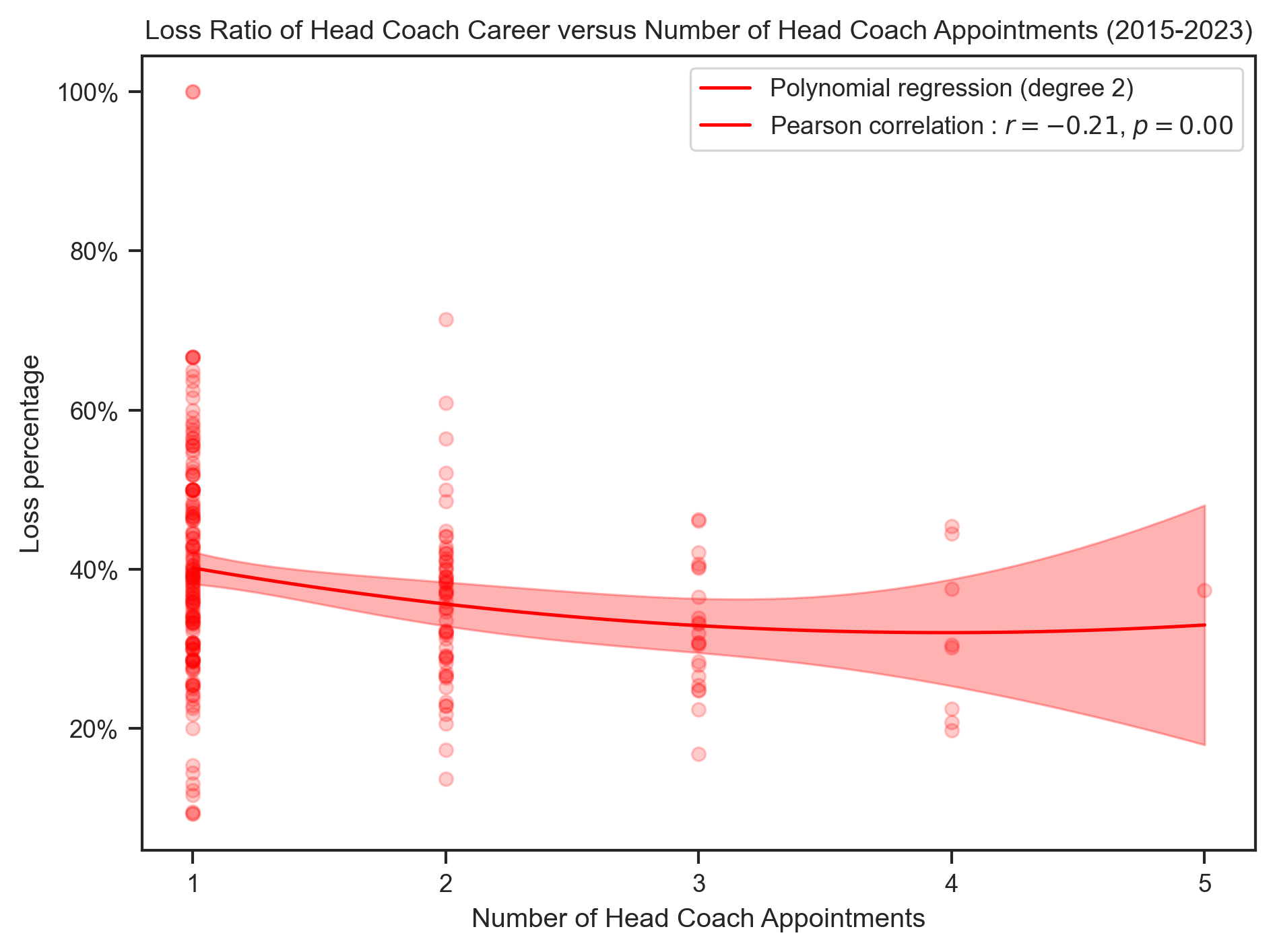
title = (
"{} Ratio of Head Coach Career versus Number of Head Coach Appointments (2015-2023)"
)
x_label = "Number of Head Coach Appointments"create_polynomial_regression_plot(
hc_results,
"ClubCount",
"WinPercentage",
"Win",
"green",
title.format("Win"),
x_label,
degree=2,
integer_ticks=True,
)
create_polynomial_regression_plot(
    hc_results,
    "ClubCount",
    "DrawPercentage",
    "Draw",
    "gray",
    title.format("Draw"),
    x_label,
    degree=2,
    integer_ticks=True,
)
create_polynomial_regression_plot(
    hc_results,
    "ClubCount",
    "LossPercentage",
    "Loss",
    "red",
    title.format("Loss"),
    x_label,
    degree=2,
    integer_ticks=True,
)
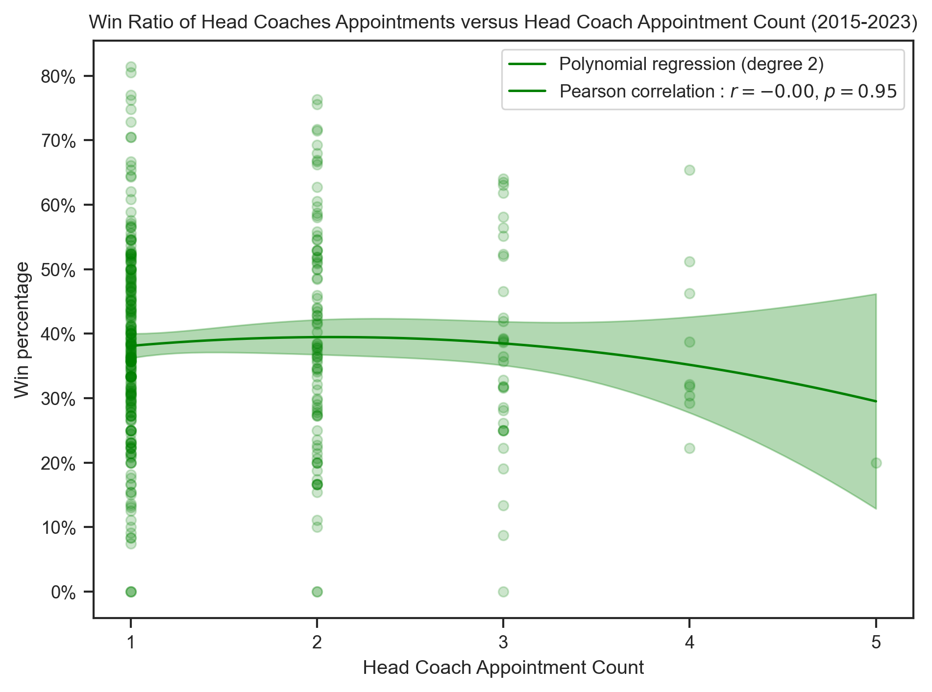
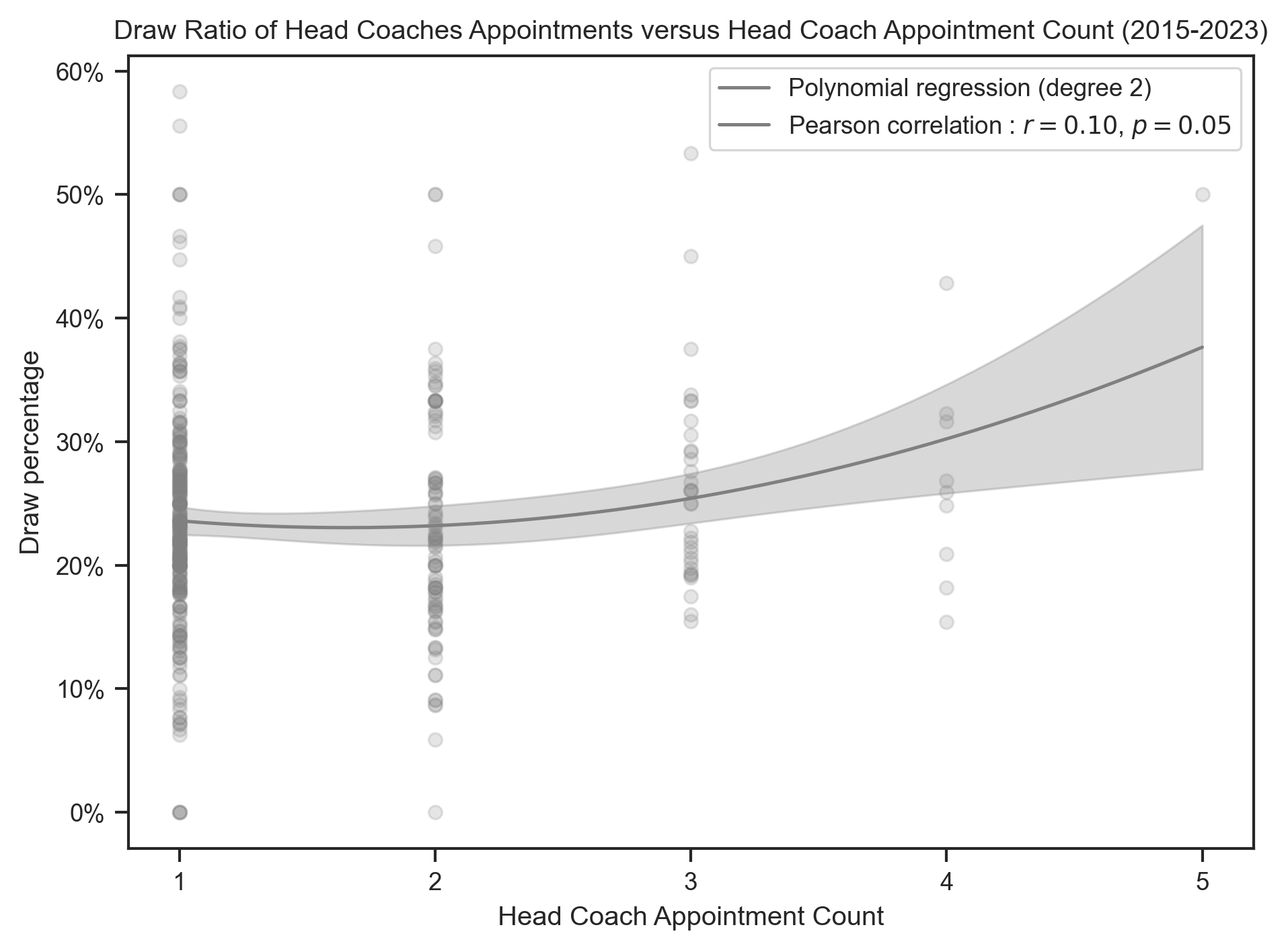
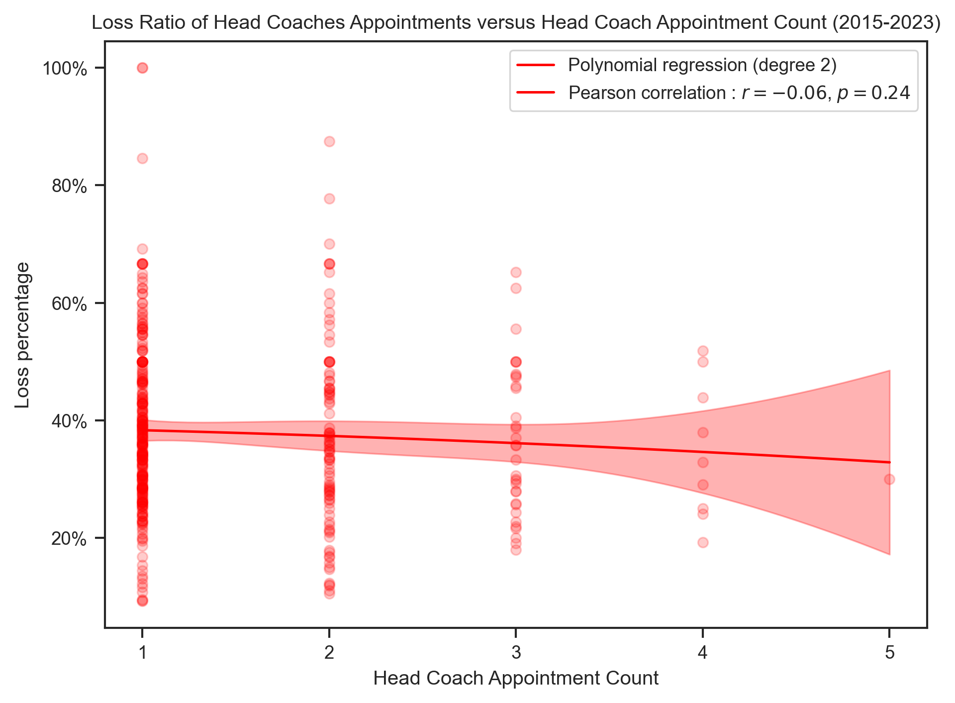
Relation between Head Coach Appointments Results versus Head Coach Appointments Counts
title = "{} Ratio of Head Coaches Appointments versus Head Coach Appointment Count (2015-2023)"
x_label = "Head Coach Appointment Count"
create_polynomial_regression_plot(
head_coach,
"AppointmentNumber",
"WinPercentage",
"Win",
"green",
title.format("Win"),
x_label,
degree=2,
integer_ticks=True,
)
create_polynomial_regression_plot(
    head_coach,
    "AppointmentNumber",
    "DrawPercentage",
    "Draw",
    "gray",
    title.format("Draw"),
    x_label,
    degree=2,
    integer_ticks=True,
)
create_polynomial_regression_plot(
    head_coach,
    "AppointmentNumber",
    "LossPercentage",
    "Loss",
    "red",
    title.format("Loss"),
    x_label,
    degree=2,
    integer_ticks=True,
)
Loading data
match_results = pl.read_csv(
    Path("./../data/match_results.csv"),
).cast(
    {
        "DaysInPost": pl.Int64,
        "Goals": pl.Int64,
        "Date": pl.Date,
    }
)
match_results.head()
---------------------------------------------------------------------------
FileNotFoundError Traceback (most recent call last)
Cell In[22], line 2
1 # | label: joint_data
----> 2 match_results = pl.read_csv(
3 Path("./../data/match_results.csv"),
4 ).cast(
5 {
6 "DaysInPost": pl.Int64,
7 "Goals": pl.Int64,
8 "Date": pl.Date,
9 }
10 )
11 match_results.head()
File ~/GitHub/head_coach_dismissal/.venv/lib/python3.13/site-packages/polars/_utils/deprecation.py:128, in deprecate_renamed_parameter.<locals>.decorate.<locals>.wrapper(*args, **kwargs)
123 @wraps(function)
124 def wrapper(*args: P.args, **kwargs: P.kwargs) -> T:
125 _rename_keyword_argument(
126 old_name, new_name, kwargs, function.__qualname__, version
127 )
--> 128 return function(*args, **kwargs)
File ~/GitHub/head_coach_dismissal/.venv/lib/python3.13/site-packages/polars/io/csv/functions.py:549, in read_csv(source, has_header, columns, new_columns, separator, comment_prefix, quote_char, skip_rows, skip_lines, schema, schema_overrides, null_values, missing_utf8_is_empty_string, ignore_errors, try_parse_dates, n_threads, infer_schema, infer_schema_length, batch_size, n_rows, encoding, low_memory, rechunk, use_pyarrow, storage_options, skip_rows_after_header, row_index_name, row_index_offset, sample_size, eol_char, raise_if_empty, truncate_ragged_lines, decimal_comma, glob)
541 else:
542 with prepare_file_arg(
543 source,
544 encoding=encoding,
(...) 547 storage_options=storage_options,
548 ) as data:
--> 549 df = _read_csv_impl(
550 data,
551 has_header=has_header,
552 columns=columns if columns else projection,
553 separator=separator,
554 comment_prefix=comment_prefix,
555 quote_char=quote_char,
556 skip_rows=skip_rows,
557 skip_lines=skip_lines,
558 schema_overrides=schema_overrides,
559 schema=schema,
560 null_values=null_values,
561 missing_utf8_is_empty_string=missing_utf8_is_empty_string,
562 ignore_errors=ignore_errors,
563 try_parse_dates=try_parse_dates,
564 n_threads=n_threads,
565 infer_schema_length=infer_schema_length,
566 batch_size=batch_size,
567 n_rows=n_rows,
568 encoding=encoding if encoding == "utf8-lossy" else "utf8",
569 low_memory=low_memory,
570 rechunk=rechunk,
571 skip_rows_after_header=skip_rows_after_header,
572 row_index_name=row_index_name,
573 row_index_offset=row_index_offset,
574 eol_char=eol_char,
575 raise_if_empty=raise_if_empty,
576 truncate_ragged_lines=truncate_ragged_lines,
577 decimal_comma=decimal_comma,
578 glob=glob,
579 )
581 if new_columns:
582 return _update_columns(df, new_columns)
File ~/GitHub/head_coach_dismissal/.venv/lib/python3.13/site-packages/polars/io/csv/functions.py:697, in _read_csv_impl(source, has_header, columns, separator, comment_prefix, quote_char, skip_rows, skip_lines, schema, schema_overrides, null_values, missing_utf8_is_empty_string, ignore_errors, try_parse_dates, n_threads, infer_schema_length, batch_size, n_rows, encoding, low_memory, rechunk, skip_rows_after_header, row_index_name, row_index_offset, sample_size, eol_char, raise_if_empty, truncate_ragged_lines, decimal_comma, glob)
693 raise ValueError(msg)
695 projection, columns = parse_columns_arg(columns)
--> 697 pydf = PyDataFrame.read_csv(
698 source,
699 infer_schema_length,
700 batch_size,
701 has_header,
702 ignore_errors,
703 n_rows,
704 skip_rows,
705 skip_lines,
706 projection,
707 separator,
708 rechunk,
709 columns,
710 encoding,
711 n_threads,
712 path,
713 dtype_list,
714 dtype_slice,
715 low_memory,
716 comment_prefix,
717 quote_char,
718 processed_null_values,
719 missing_utf8_is_empty_string,
720 try_parse_dates,
721 skip_rows_after_header,
722 parse_row_index_args(row_index_name, row_index_offset),
723 eol_char=eol_char,
724 raise_if_empty=raise_if_empty,
725 truncate_ragged_lines=truncate_ragged_lines,
726 decimal_comma=decimal_comma,
727 schema=schema,
728 )
729 return wrap_df(pydf)
FileNotFoundError: No such file or directory (os error 2): ../data/match_results.csvRelation between match outcomes and head coaches days in post during match
# Exclude rows where don't have information about head coach days in post during match
match_results = match_results.drop_nulls(subset=["DaysInPost"])
# Exclude rows with DaysInPost more than 4000
match_results = match_results.filter(pl.col("DaysInPost") <= 4000)
# The reason for this is that we have records of Arsenal head coach Arsene Wenger who has been in post for 22 years.
# Our data start date for matches is 2015. This makes some matches start with a head coach tenure of 5000 days.

match_results = match_results.with_columns(
    pl.when(pl.col("Result") == "win").then(1).otherwise(0).alias("Win"),
    pl.when(pl.col("Result") == "loss").then(1).otherwise(0).alias("Loss"),
    pl.when(pl.col("Result") == "draw").then(1).otherwise(0).alias("Draw"),
)
# Create a histogram of 'match_count' over 'days_in_post'
plt.figure()
sns.histplot(
data=match_results,
x="DaysInPost",
bins=16,
stat="proportion",
binrange=(0, 4000),
alpha=1,
)
plt.gca().yaxis.set_major_formatter(mticker.PercentFormatter(xmax=1))
plt.xlim(0, 4000)
plt.xlabel("Days in Post")
plt.ylabel("Proportion of Matches")
plt.title("Distribution of Matches versus Head Coach Days in Posts (2017 - 2022)")
plt.show()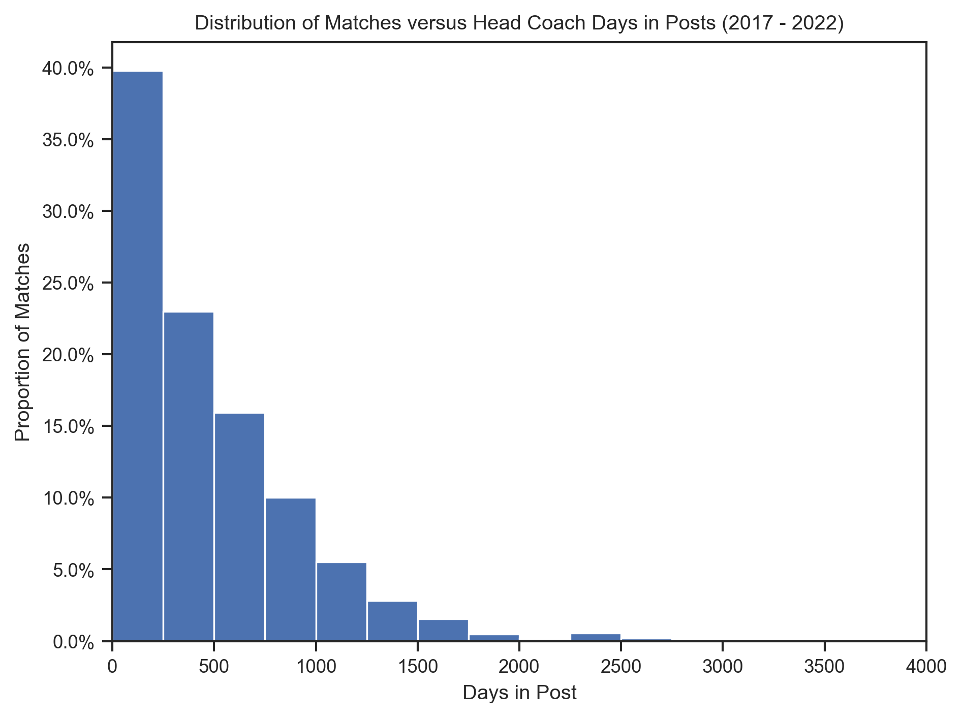
def plot_match_outcome_over_coach_tenure(data, y_value, y_label, color):
    # Create a jointplot
    g = sns.jointplot(
        data=data,
        x="DaysInPost",
        y=y_value,
        kind="reg",
        scatter_kws={"alpha": 0.5, "color": color},
        line_kws={"color": color},
        ratio=3,
        marginal_ticks=False,
    )
    g.figure.set_figwidth(6)
    g.figure.set_figheight(2)
    g.figure.suptitle(f"Match outcome over Head Coach Days in Post", x=0.4, y=1.1)
    g.set_axis_labels("Head Coach Days in Post", "Match Outcome")

    # Legend
    days_vals = data.select(pl.col("DaysInPost")).to_numpy().flatten()
    y_vals = data.select(pl.col(y_value)).to_numpy().flatten()
    r, p = pearsonr(days_vals, y_vals)
    legend = g.ax_joint.legend(
        [f"r = {r:.2f}, p = {p:.2f}"], loc="upper left", bbox_to_anchor=(1, 1.6)
    )
    legend.set_title("Pearson correlation")

    # Set y-axis tick
    g.ax_joint.set_yticks([0, 1])
    g.ax_joint.set_yticklabels(["not " + y_label, y_label])
plot_match_outcome_over_coach_tenure(match_results, "Win", "won", "green")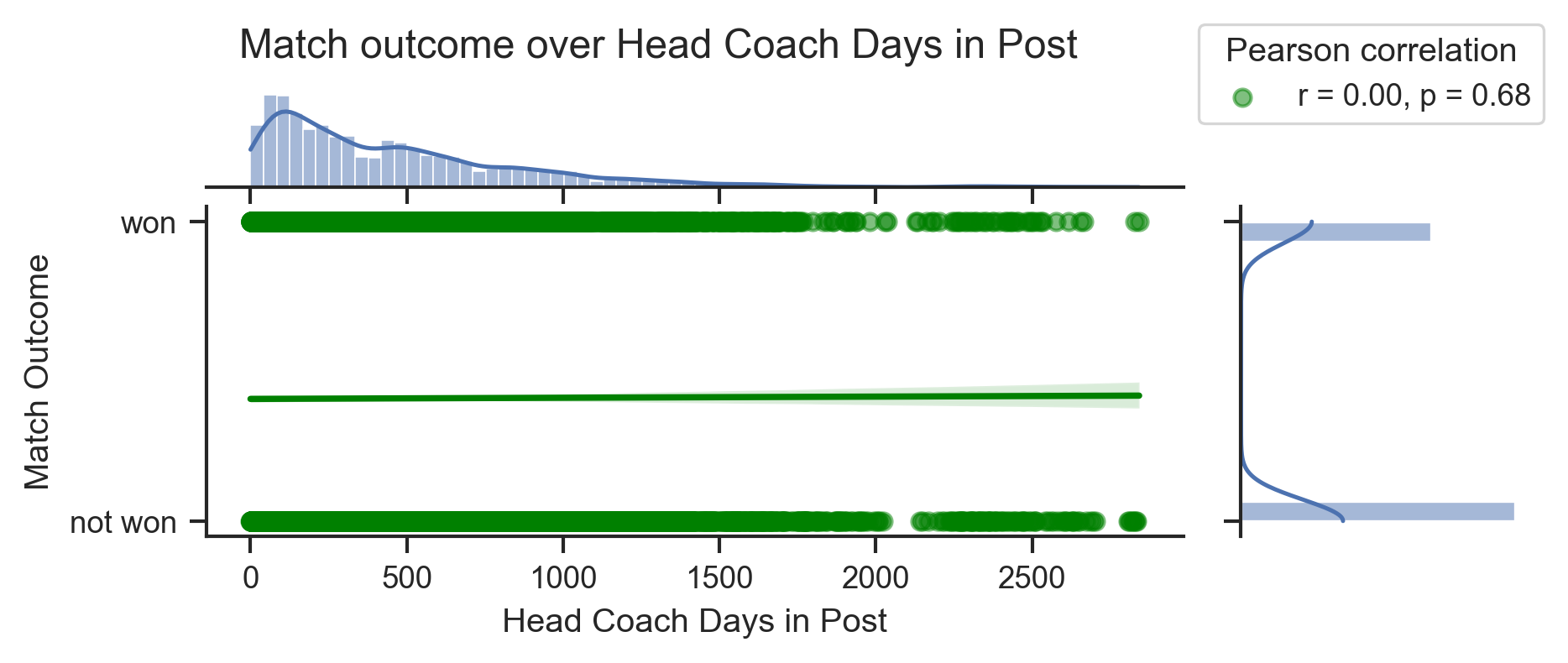
plot_match_outcome_over_coach_tenure(match_results, "Draw", "draw", "gray")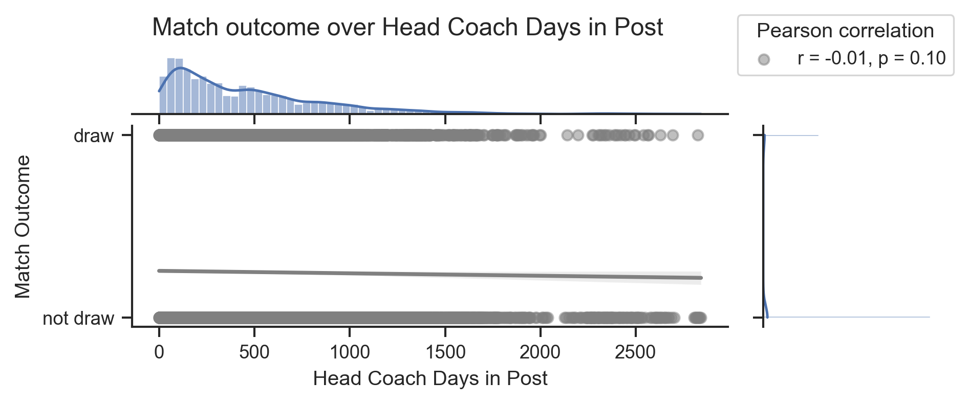
plot_match_outcome_over_coach_tenure(match_results, "Loss", "loss", "red")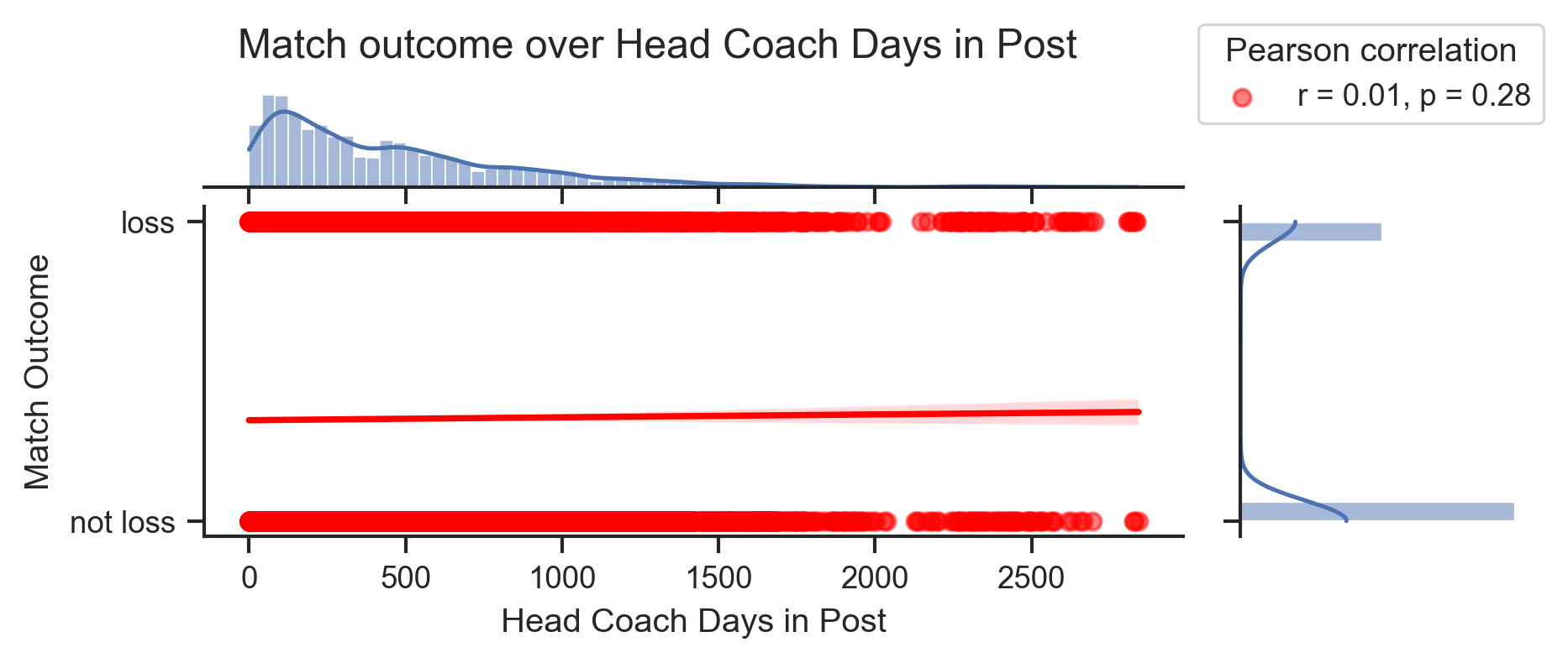
n_match = match_results.height
n_win = match_results.filter(pl.col("Result") == "win").height
n_draw = match_results.filter(pl.col("Result") == "draw").height
n_loss = match_results.filter(pl.col("Result") == "loss").height
Parmi l’ensemble des matchs où l’on possède des informations sur l’entraîneur sportif et où l’entraîneur sportif avait moins de 1500 jours d’ancienneté lors du match :
le pourcentage de match gagné est de Unexecuted inline expression for: f'{n_win/n_match:.2%}'.
le pourcentage de match nul est de Unexecuted inline expression for: f'{n_draw/n_match:.2%}'.
le pourcentage de match perdu est de Unexecuted inline expression for: f'{n_loss/n_match:.2%}'.
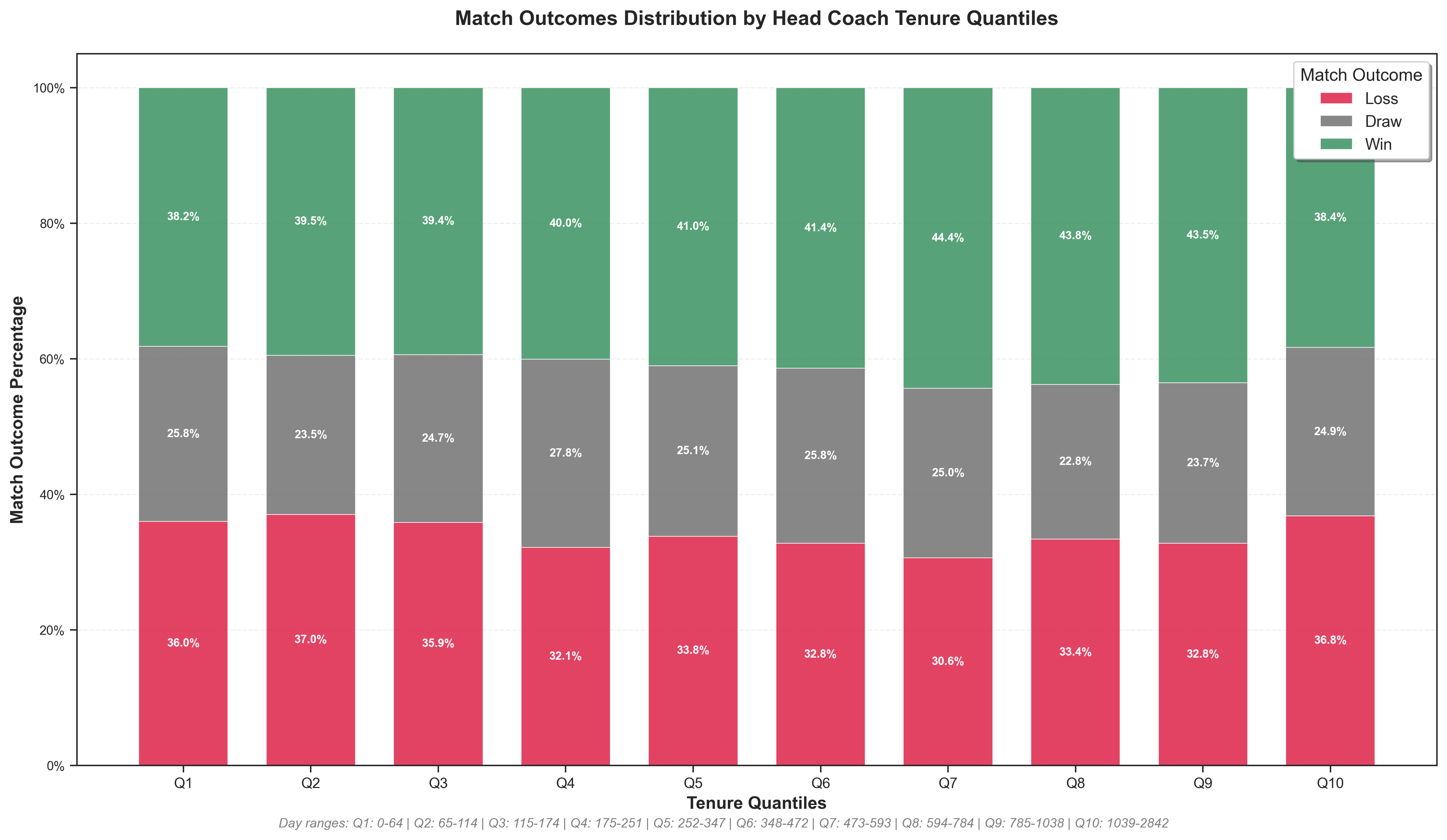
# Create quantile-based groups for more balanced sample sizes
n_quantiles = 10

match_outcomes = (
    match_results.with_columns(
        pl.col("DaysInPost")
        .qcut(n_quantiles, labels=[f"Q{i + 1}" for i in range(n_quantiles)])
        .alias("TenureGroup")
    )
    .group_by("TenureGroup")
    .agg(
        (100 * pl.col("Win", "Draw", "Loss").sum() / pl.len())
        .round(2)
        .name.suffix("Rate"),
        pl.col("DaysInPost").min().alias("MinDaysInPost"),
        pl.col("DaysInPost").max().alias("MaxDaysInPost"),
    )
).sort("MinDaysInPost")

match_outcomes
Loading...
# Create the stacked bar chart with improved styling
plt.figure(figsize=(14, 8))

# Define better colors
colors = {
    "win": "#2E8B57",  # Sea green
    "draw": "#696969",  # Dim gray
    "loss": "#DC143C",  # Crimson
}

# Extract the rates for stacking
loss_rates = match_outcomes.get_column("LossRate")
draw_rates = match_outcomes.get_column("DrawRate")
win_rates = match_outcomes.get_column("WinRate")

# Create the stacked bars with improved styling
x_pos = np.arange(len(match_outcomes))
width = 0.7

bars1 = plt.bar(
    x=x_pos,
    height=loss_rates,
    color=colors["loss"],
    alpha=0.8,
    label="Loss",
    width=width,
    edgecolor="white",
    linewidth=0.5,
)
bars2 = plt.bar(
    x=x_pos,
    height=draw_rates,
    bottom=loss_rates,
    color=colors["draw"],
    alpha=0.8,
    label="Draw",
    width=width,
    edgecolor="white",
    linewidth=0.5,
)
bars3 = plt.bar(
    x=x_pos,
    height=win_rates,
    bottom=loss_rates + draw_rates,
    color=colors["win"],
    alpha=0.8,
    label="Win",
    width=width,
    edgecolor="white",
    linewidth=0.5,
)

# Customize the plot with better styling
plt.xlabel("Tenure Quantiles", fontsize=12, fontweight="bold")
plt.ylabel("Match Outcome Percentage", fontsize=12, fontweight="bold")
plt.title(
    "Match Outcomes Distribution by Head Coach Tenure Quantiles",
    fontsize=14,
    fontweight="bold",
    pad=20,
)

# Improved x-axis labels
quantile_labels = [f"Q{i + 1}" for i in range(n_quantiles)]
plt.xticks(x_pos, quantile_labels, fontsize=10)

# Enhanced legend
plt.legend(
    loc="upper right",
    frameon=True,
    fancybox=True,
    shadow=True,
    fontsize=11,
    title="Match Outcome",
    title_fontsize=12,
)

# Improved formatting
plt.gca().yaxis.set_major_formatter(mticker.PercentFormatter())
plt.grid(axis="y", alpha=0.3, linestyle="--")
plt.ylim(0, 105)  # Add some space at the top

# Add value labels on bars for better readability
for i, (loss, draw, win) in enumerate(zip(loss_rates, draw_rates, win_rates)):
    # Only show values if they're significant enough
    if loss > 5:
        plt.text(
            i,
            loss / 2,
            f"{loss:.1f}%",
            ha="center",
            va="center",
            fontweight="bold",
            fontsize=8,
            color="white",
        )
    if draw > 5:
        plt.text(
            i,
            loss + draw / 2,
            f"{draw:.1f}%",
            ha="center",
            va="center",
            fontweight="bold",
            fontsize=8,
            color="white",
        )
    if win > 5:
        plt.text(
            i,
            loss + draw + win / 2,
            f"{win:.1f}%",
            ha="center",
            va="center",
            fontweight="bold",
            fontsize=8,
            color="white",
        )

plt.tight_layout()

# Add subtitle with day ranges in a more elegant way
subtitle_text = "Day ranges: " + " | ".join(
    [
        f"Q{i + 1}: {row['MinDaysInPost']}-{row['MaxDaysInPost']}"
        for i, row in enumerate(match_outcomes.to_dicts())
    ]
)
plt.figtext(
    0.5, -0.0, subtitle_text, ha="center", fontsize=9, style="italic", color="gray"
)

plt.show()